Beware: Proper Hanging Hardware

There is more to fine art picture framing than just aesthetics, proportions, and color theory; we are engineers who need to consider how to combat one of art’s great enemies: gravity. A beautifully made frame with matching mat and fillet are not very useful if they end in a pile of glass on the floor.

Here is a great example: A client used the wrong hanging orientation on their artwork, damaging the hanging hardware and risking an accident. The D-Ring hangers were originally mounted vertically for two hooks or for hanging on a picture rail. The later addition of a wire pulled the D-rings towards the center, twisting the metal almost apart. Yikes!

Do you have a question about the best way to hang a heavy piece of art or a mirror? Bring in your piece for a consultation, or send some photos to info@baasframingstudio.com and we’ll be happy to help!

Standard Wire orientation is a must for most framing projects: the gentle angle of the D-ring mimics the direction of the wire while it is hanging on the wall, thus relieving tension in the hook itself. For picture rail hanging systems, the wires must be directed straight up to attach to the picture rail itself.

D Ring picture hanger is bent out of shape by gravity and tension

Here you can see the difference: the D-Ring on the left is normal. The D-Ring on the right was not hung with proper wire orientation and the pressure has pulled the D-Ring out of shape. This can be dangerous if the hook fails all together.

Moral of the Story: when in doubt give us a call or email! We are more than happy to discuss the best options for safely hanging your art. We guarantee all our frames will have the proper hanging hardware and wire orientation. No bent hooks here!
Framing Redesigns: A Collection of Native Arrowheads

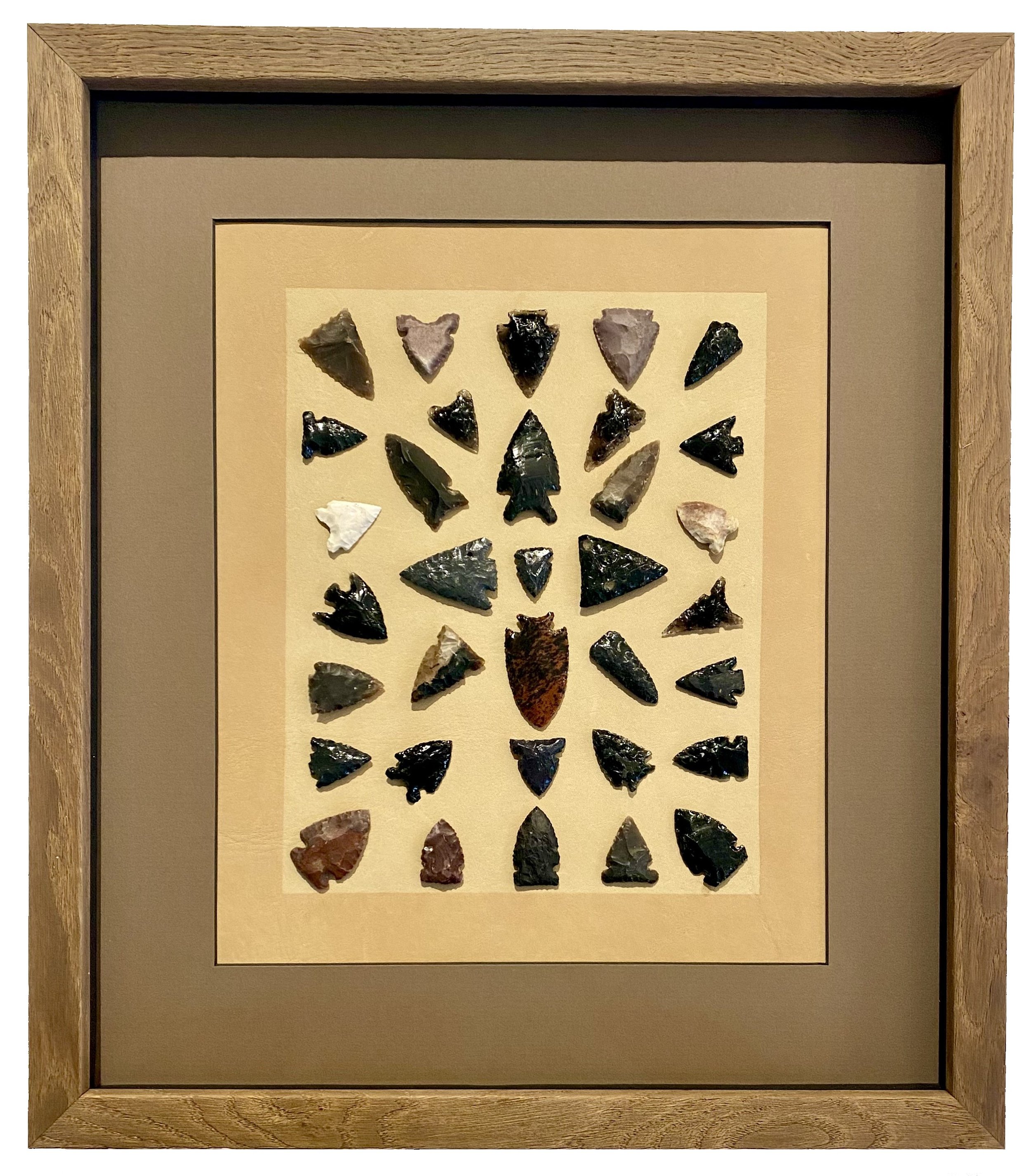
This beautiful mount of hand-collected arrowheads was in need of some attention. The initial glue mount of one of the arrowheads in the top left corner failed, leaving the arrowhead free and potentially damaging the other arrowheads around it.

You can see the fallen arrowhead in the left upper corner. The original frame had a fun, native motif but was not conservation-quality; nor was the mat, as the bevel was brown, indicating acid and the associated discoloration.

So our first course of action was to take apart the old frame and reglue the arrowhead to the backing. In this case, the backing was a extremely unique material: real leather hide! The leather was heavy so there were extra precautions taken to ensure that it would not slide around underneath the new matting.

There is wear and tear around the old frame edges, and a few parts where the veneer was pulling back. A new and deeper frame would allow a true shadow-box treatment.

Once the old matting was removed, we found that the leather had discolored under the mat. Instead of hiding this new element under a mat that would produce the same pinched proportions as before, we opened up the design and leaned into the unique extra line.

Here you can see the depth of the new frame, which allowed a shadowbox to be built. The sides of the box were lined in black to give even more dramatic dimension against the grey/brown top mat.

This extra line became a beautiful addition around the arrowheads and acted almost as a second mat. By moving the mat line outwards and adding several more inches of top-mat around the whole design, the piece became lighter, more focused on the arrowheads, and ultimately more inviting to the eye.

The finished piece: a beautiful woodgrain frame with an open shadowbox in shades of tan, black, and soft brown.

The result is a beautifully reframed piece with better dimensions and Optium Museum Acrylic which lets viewers see the fine details of these exquisite arrowheads up close and with more clarity than before: Stunning!

Best of 2023

As we enter the new year, we always take a moment to appreciate the most unique and beautiful framing projects we had the pleasure of working on throughout 2023. It's a joy to reflect on the fine art and family mementos that passed through our studio, and we look forward to providing more amazing design ideas in the year ahead. Enjoy!

"Bronze Fins", print by Shag in a bronze metallic frame by AMCI. If ever there was a frame made for a piece of art, this is it! The black matting adds a dramatic touch.

Stained glass in a silver gilt frame. The floating look was achieved by mounting the inner frame to a sheet of clear acrylic -- a great solution to create privacy in the client's window.

Korean wedding jacket and shirt in an ivory linen shadowbox with ebonized walnut frame from Picture Woods. We took great care in the mounting of this precious item, including the use of Optium Museum Acrylic for optimal clarity and protection from UV light damage.

"Bally" poster by Bernard Villemot gets a classic treatment in a black frame and white mat. Great design never goes out of style!

Collectible masks in silver shadowbox frames: this project turned out super sharp! The masks were mounted to linen boards in contrasting tones. A great example of how small objects can be given greater presence with framing.

The client wanted to amplify the pastel colors and organic feeling of this 2023 concert poster. We pride ourselves on a having huge selection of frame samples (like this pink-and-purple inlaid wood frame from Italy) just for unique projects like this. Fun!

Best of 2022 Part 2

There were so many unforgettable projects from last year that we could not help but share a few more. Our staff looks forward to making YOUR framing dreams come true in 2023!

ski patrol shadowbox filled with mementos and pins

We created this Ski Patrol shadowbox to showcase the patches, pins and insignia collected over a lifetime of winter sports and service. Our framer Heather organized the many small items into a pleasing, balanced composition. We'd love to help you create a framed collection like this!

parisian mask in acrylic box with red and gold backing

One of the stand-outs! This Parisian Carnival Mask in a custom acrylic box looked simply stunning. We created a gold and red fabric platform to add some color and a touch of luxe. The box protects the feathers and mask from dust and light.

Ohtani jersey in shadowbox with sporty red and navy blue details

Signed jerseys are always fun projects, but this one stood out for the addition of collectible cards. We folded the jersey to keep the project to a reasonable size. The red filet adds a sporty touch to the black shadowbox frame.

The client wanted to have some fun with this original Bob Mackie drawing for his "Fantasy Goddess of Asia" Barbie design. We chose lime-green "Wasabi" silk matting and a rounded gold metal frame for a glam presentation befitting the designer.

A wine mishap led this customer to replace their linen liner. So we took the opportunity and upgraded not only her liner but added a dark wood frame and a perfectly matched fillet. The tones in the frame and liner play so nicely with the image that it creates a presentation that is greater than the sum of its parts.